Retirement re-invisioned
Company - Wells Fargo Advisors
Role - CX Interaction Designer
Project Timeline - 2015/2017
Project Status - Deployed
Project Overview
My Role: CX Interaction Designer
Key Stakeholder:
Wells Fargo Retirement Management Leadership
Core Project Team:
Product Owner
Business Development Manager
Business Analysts
UX Designer
Front-end and Back-end Developers
UX Researcher
Business Case
Wells Fargo wants to provide asset management solutions through an intuitive and modern tool that helps affluent banking clients, together with their financial advisors, create an effective retirement plan.
What I did
I led the visual redesign of the primary customer facing product Envision®, a robust retirement tool designed to make the working relationship between affluent banking clients and their financial advisors simpler. The result was a fresh new modern interface that received significant praise over the original version, and prompted executive leadership to move forward with the updated look and feel.
Envision®
Envision® is tool allowing affluent Wells Fargo customers with $250,000 or more in assets to view their retirement plan through their WF Brokerage account. The Envision Plan is a customized plan composed of the customer’s assets, personal goals, portfolio allocations and more.
Envision Scenarios, an additional feature, offers customers the benefit of being able to create “what if” situations based on their plan. These scenarios allow the customer to see real-time changes to their Envision Score. This score is a special number indicating whether the customer is on target, above target meaning they can take fewer financial risks, or below target meaning they can be a little riskier. Once the customer creates a new scenario, they can then schedule an appointment with their financial advisor to have a further discussion around adjusting their plan.
how did we get here?
The original intention for Envision was to continue refining features of the tool and build upon what already existed. The challenge here was trying to improve the flow and way in which the information was being presented.
Together with the UX designer, we took this design through user testing, however, we found that users were having a tough time dissecting everything on the page. While there were users who only cared about seeing the information on the page, we also learned that a majority wanted to look at something more visually attractive.
further iteration
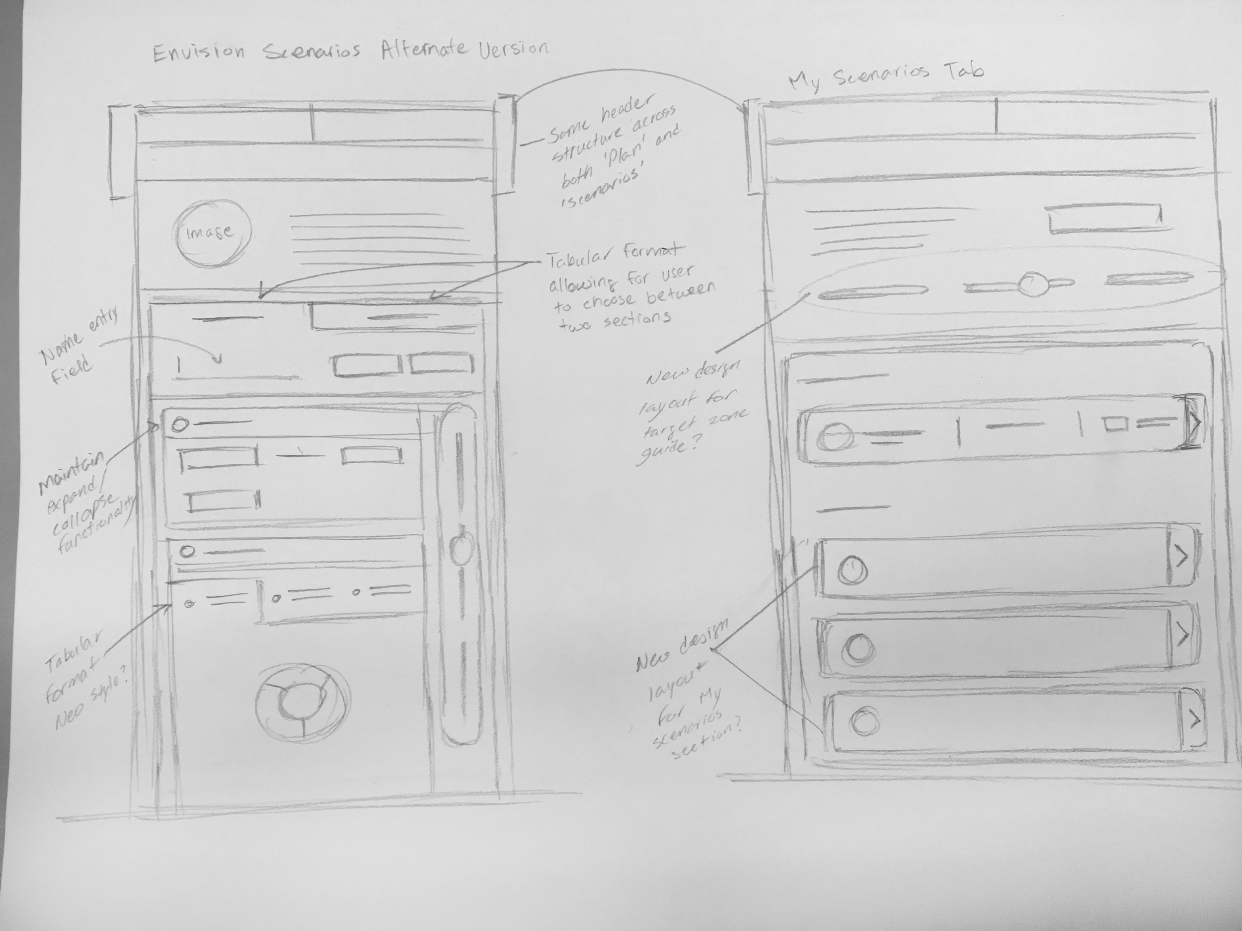
Taking what we learned from testing, the UX Designer and I got together and started brainstorming new ideas and concepts for how to improve the flow and visuals.
envision® 2.0
The new and improved Envision boasted not only a more streamlined design, but also more intuitive user functionality and hierarchy. Inspiration for pushing the visual design beyond the standard came from user consideration, but also from a need to brand this tool as something that felt as though it could stand on its own if necessary.
There was a keen interest in Envision being a premier tool for Wells Fargo’s current eBrokerage customer base, as well as an opportunity to engage and attract future customers. To appeal to a younger financial audience, this tool needed to have character and appeal while still being a Wells Fargo product.


